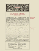
The Oldtype "Benedictine Pro" Family
Current Version: Under Development (Last Update: 2013.07.24) - Coming Soon
[ Specimen ] - [ Sample Characters ] - [ License ]
Basic Commercial Licenses available soon at MyFonts
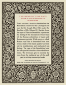
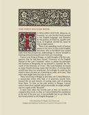
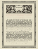
A comprehensive and faithful rendition of a classic face of marked beauty and of a broad range of usefulness. Joseph E. Hill and Edward E. Bartlett designed the Benedictine family (including Book, Regular and Bold weights, with accompanying Small Caps and Italics) between 1915 and 1922 for the Mergenthaler Linotype Company in New York. In the words of the original designers, "the Benedictine face was derived from the types of Plato de Benedictis, an Italian master printer of the Fifteenth Century, who is known to have produced thirty-three books between the years 1487 and 1495. Its origin thus traces back to the days immediately preceding the discovery of America, the period of the Italian Renaissance, when artists and master craftsmen were creating beautiful things under the inspiration of classic architecture, fine manuscripts and paintings from that great storehouse of art in which they worked. The classic character of the face is particularly apparent in its capitals. The characteristics of the lower case letters are derived from manuscript technique." Hill and Bartlett were highly successful in preserving the beauty of form, the distinction, and the hand-wrought character of the original letters, and at the same time in adapting them to the needs and printing processes of their time.
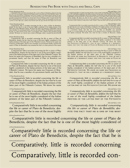
The Oldtype "Benedictine Pro" Family comprises six fonts—Book, Regular and Bold "uniwidth" weights, with accompanying true Italics—which include OpenType features with full regard for the requirements of graphic design and printing processes today. Among other features, each font includes true Small Caps, four sets of figures, unlimited fractions, several stylistic alternates, standard and discretionary ligatures, ornaments, comprehensive kerning, and support for most Latin alphabets. The Book, Regular and Bold Romans (uprights) are just finished. Accompanying Italics are expected to be completed within the next weeks. The six fonts will be available individually as well as a complete family pack at a special price.
The main sources used during the digital fonts design process were as follows: McGrew, M. (1993), American Metal Typefaces of the Twentieth Century (Second, Revised Edition), New Castle: Oak Knoll Books (pp. 30-1); Mergenthaler Linotype Company (1923), The Manual of Linotype Typography, Norwood: Plimpton Press (pp. 123-72); and Mergenthaler Linotype Company (1939), Specimen Book - Linotype Faces, New York: Mergenthaler Linotype Company (pp. 19-42).
Selected high-resolution font sheets available for purchase at the Digital Press
____________


